 Analytics
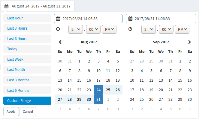
In the Analytics section, all the statistics from the user’s devices are collected. You can output data from all devices / from a group of devices / from a specific device for a selected period of time. To do this, use the drop-down list of groups or the list of devices.

Each tab of the Analytics section refers to the selected device list and time interval.
Also, all graphics are equipped with a smart legend, allowing you to customize their appearance at your convenience, deactivating the display of certain parameters.
Also Seemetrix allows you to upload statistics of views in csv format, for this click  .
.
General
This tab displays aggregate traffic data from all the selected devices.

OTS – the number of people fixed in front of the camera (even those who did not look at the camera / on the screen are counted). The global human traffic.
Watchers – the number of people who looked at the object of attention attracting (to the camera / on the screen with content).
Conversion ratio – the ratio of the Watchers indicator to OTS.
Dwell time – the total time in seconds, during which people were in front of the camera.
Attention time – the total time in seconds, during which people were looking at the object of attention attracting (to the camera / to the screen with content).
Attraction ratio – the ratio of Attention time to Dwell time.
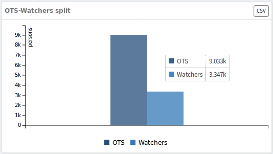
The OTS-Watchers split graph shows the total number of all detected visitors (OTS) and all the accomplished watches (Watchers) for the specified time period.
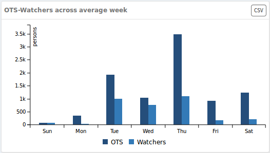
The OTS-Watchers across average week graph shows the day-by-week allocation of the number of all detected visitors (OTS) and all accomplished watches (Watchers) for the specified period of time. Based on the data presented, you can draw a conclusion on what day of the week the most intense flow of people occurs.
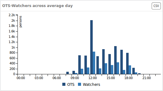
The OTS-Watchers across average day graph shows the hours of day allocation of the number of all detected visitors (OTS) and all accomplished watches (Watchers) for the specified period of time. On the basis of the data presented, you will be able to make a conclusion on what hour is the most intensive traffic.
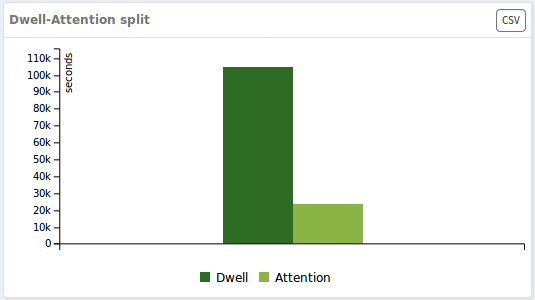
The Dwell-Attention split graph shows the total time during which people were in front of the camera, and the time of all views accomplished for the selected time interval.
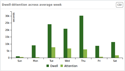
The Dwell-Attention across average week graph shows the days of the week allocation of the time in front of the camera and the viewing time in seconds for the specified time interval. Thus, based on the submitted data, you can see in which day of the week the views are the longest.
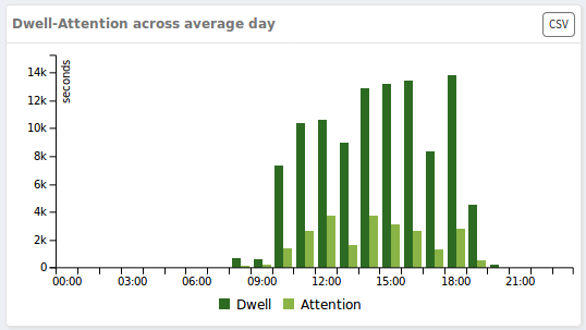
The Dwell-Attention across average day across average day graph shows the hours allocation in front of the camera and viewing time in seconds for the specified time interval. Data clearly illustrate what hours have the most intense people flow.
Demographics
The Demographics tab contains the information about the views regarding gender, age and emotions over the specified time interval on the selected devices.
The upper information block contains the following indicators:

- Male – percentage of views accomplished by men;
- Female – percentage of views accomplished by women;
- Top demographic group – the demographic group, which accounted for the maximum number of views;
- Male average attention – average duration of men views in seconds;
- Female average attention – average duration of women views in seconds;
- Top attention time – demographic group, which accounted for the longest viewing.
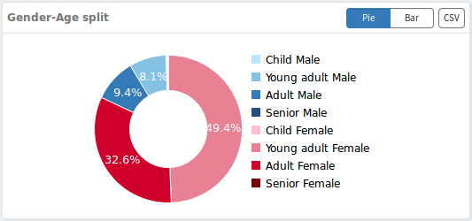
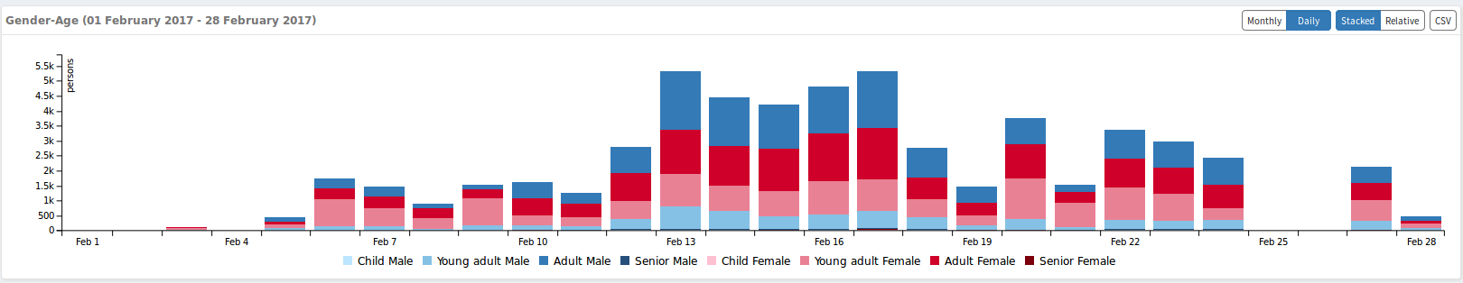
The Gender-Age split shows the allocation of the total number among different demographic groups:
- child female – women under 15;
- young female – women from 16 to 35;
- adult female – women from 36 to 55;
- senior female – women 56 and older;
- child male – men under 15 years;
- young male – men from 16 to 35;
- adult male – men from 36 to 55;
- senior male – men from 56 and older.
The Gender split graph shows the ratio of views relative to gender groups.

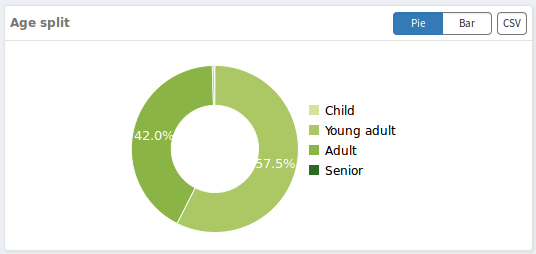
The Age split graph shows the ratio of views relative to age groups.
These graphs (Gender-Age split / Gender split / Age split) can be represented both as pie charts, and as histograms. To switch the way data is displayed, use the keys  .
.
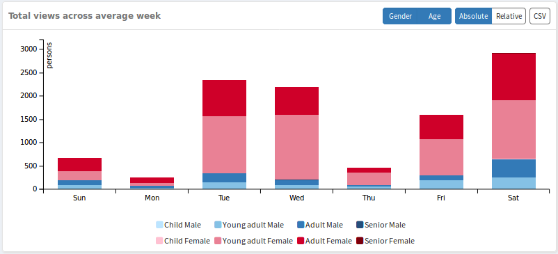
The Total views across average week graph shows the allocation of the views number of each demographic group by the days of the week for the selected time interval.
The Total views across average day graph shows the allocation of the views number of each demographic group by the hours for the selected time period.

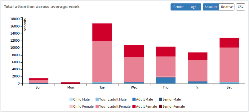
The Total attention across average week graph shows the duration of the views allocation of each demographic group by the days of the week for the selected time interval.
The Total attention across average day graph shows the duration of the views allocation by the hours of each demographic group for the selected time interval.

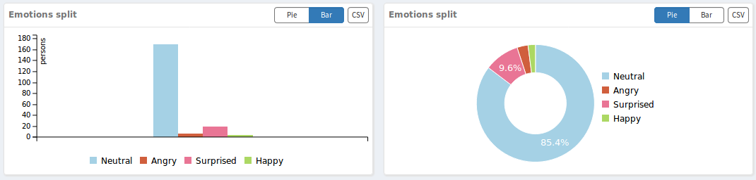
The Emotions split graph shows the ratio of emotions (happy, neutral, surprised, angry) fixed during the views for the selected time interval. It can be either as a pie chart with relative data (percentage distribution) or as a histogram with absolute magnitudes (number of views). To select a convenient display mode, use the buttons .
The Emotions-Gender split graph shows the allocation of emotions during viewing in men and women for the selected time interval.

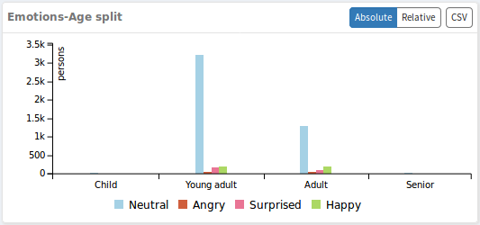
The Emotions-Age split graph shows the allocation of emotions during viewing in children (0-15), young (16-35), adults (36-55), elderly (56 and older) for the selected time interval.
Over time
The Over Time tab shows the allocation of all views among demographic groups by the days of the week or by the months of the specified time period, depending on the selected mode  . Also, the data can be presented as absolute (number of views) or relative values (percent), to change the display mode, use the buttons
  .
.
Media
The Media tab displays media file views for the selected time period.
The upper information block contains key indicators:

- Total number of OTS – the number of people fixed in front of the camera while playing media files (even those who did not look at the camera / screen are counted);
- Total number of watchers – the number of views fixed in front of the camera while playing media files;
- Top content for attention – a media file with the longest aggregate of all views (in seconds);
- Top content for happiness – a media file, when viewing it, the emotion «happy» is the most often recorded by viewers;
- Avg. dwell time – the average time in seconds that people were in front of the camera while playing media content;
- Avg. attention time – the average duration of all views fixed during the playback of media content.
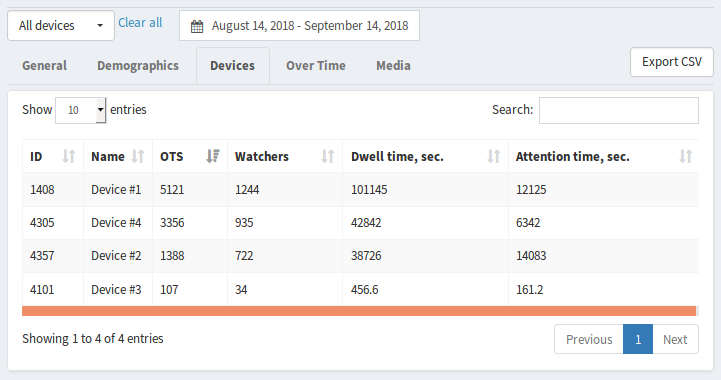
Here is a table with a list of all available media files with the main indicators:
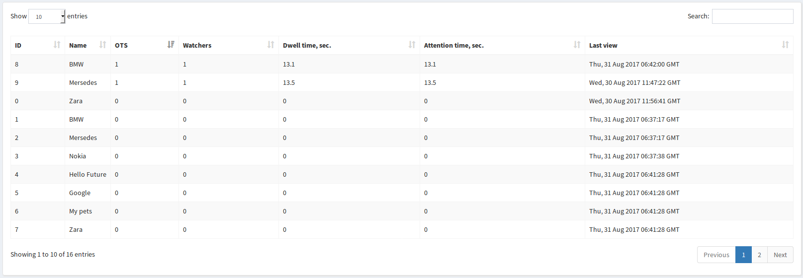
- OTS – the number of people fixed in front of the camera while playing this media file;
- Watchers – the number of times this media file was viewed;
- Dwell time, sec. – the total time in seconds, during which people were in front of the camera while playing this media file;
- Attention time, sec. – total time of all media file views in seconds.
- Last view – the date of the last media file viewing.
By clicking on the table row, you can go to the page with the key view data for the selected media.